WWE sets are always one of the coolest things about a WWE show. Over the years the company has constructed many WWE sets for events like WrestleMania, Royal Rumble, SummerSlam, Backlash and many more that have stunned the fans.
From the grand stage of WrestleMania, to gimmick pay-per-views like TLC, to old school shows like In Your House, WWE has created some memorable displays for their shows.
Today we’re going to take a look at 20 WWE sets and stages from events where the company more than delivered. Let’s get started.
#20 – One Night Stand 2008
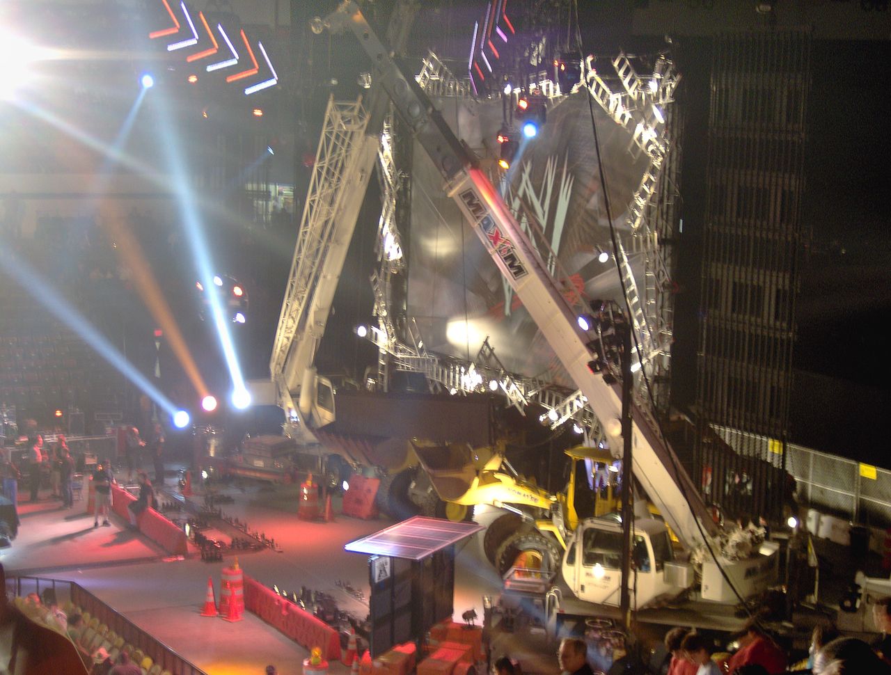
Before Extreme Rules was Extreme Rules it was ECW One Night Stand. Then when WWE decided to ditch the ECW aspect, it was just One Night Stand. The pay-per-view had its final stand (no pun intended) in 2008.
Much like Extreme Rules, the show was full of gimmick matches. This WWE set from 2008 was made up of construction equipment and it gave the show the gritty feel it needed.
#19 – Invasion
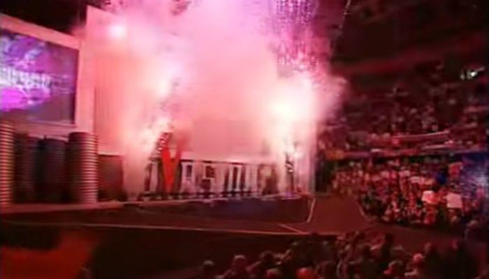
Battle lines were drawn when WCW and ECW invaded the WWE back in 2001. Eventually the conflict between The Alliance and the WWE led to the Invasion pay-per-view.
Stars from The Alliance faced off against stars from the WWE and the set offered two separate entrance ways for each team. In the middle was a big open area in the shape of a “V” which later played into the Hardcore Championship match between Jeff Hardy and Rob Van Dam.
There were two separate sides in this battle and the set for this show did a perfect job of displaying the tension between The Alliance and the WWE.
#18 – Vengeance 2005
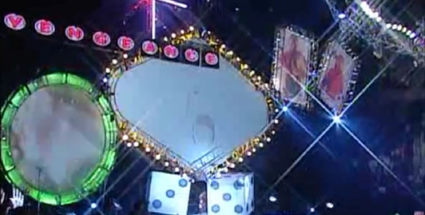
In 2005 the Vengeance pay-per-view took place from Las Vegas. WWE decided to go with the obvious gambling theme for the set and it ended up being one of the more memorable sets from that era.
Of course it helps that this pay-per-view delivered with a Hell in a Cell match between Triple H and Bastisa, along with another confrontation between Shawn Michaels and Kurt Angle.
#17 – WrestleMania IX
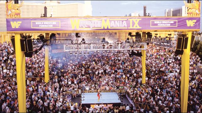
WrestleMania IX has received a lot of criticism over the years due to some wacky booking decisions that played out on the show. One thing’s for sure though, the set looked cool.
The show featured an outdoor set at Caesars Palace in Paradise, Nevada and a Roman theme. Surely all who had to be involved with the theme and/or wear a toga are embarrassed looking back on it now. But the whole appeal of the WrestleMania IX set is that it’s so bad and so tacky that it somehow ends up being good.
#16 – TLC

The TLC pay-per-view is a show that has an entrance which has taken on various incarnations over the years. However it’s hard to pick a specific year that the set looked best as the design is usually pretty similar. No matter what the set always features some display of, you guessed it, tables, ladders and chairs.
Still, the TLC set is one of the more fun WWE sets, especially when it comes to gimmick pay-per-views.
#15 – In Your House
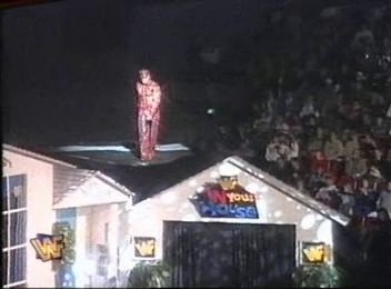
For those you of that aren’t familiar with the “In Your House” concept, it’s how WWE used to brand their pay-per-views. Eventually the show took on themes such as “In Your House: Buried Alive” and “D-Generation X: In Your House.”
But before that the set was literally a house. Pretty cool right?
#14 – Taboo Tuesday
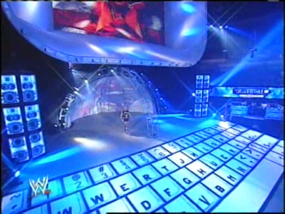
Remember Taboo Tuesday? Well for those of you that don’t, Taboo Tuesday was an interactive pay-per-view where fans could vote on match stipulations, opponents etc. It eventually evolved into Cyber Sunday before it was dropped for Bragging Rights in 2009.
Anyway, like we said, it was an interactive pay-per-view. Hence the giant keyboard for a set. The set was simple but effective and a good example of WWE using a theme to enhance the look of a show.
#13 – Night of Champions
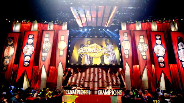
WWE always decks out the set for Night of Champions. There have been a number of variations on the set over the years and much like the TLC pay-per-view, the WWE sets for this show generally look similar.
Although it’s generally the same idea, the set usually does a pretty good job at making the championship belts look prestigious. What more could you want for a show called Night of Champions?
#12 – Armageddon 2008
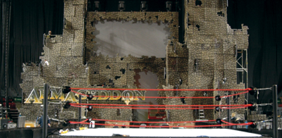
Armageddon 2008 was a special night because Jeff Hardy won his first WWE Championship. After years of working to climb the company ladder, he finally won the big one in the main event of the night.
Jeff Hardy is known to be a daredevil which is why this set was a perfect fit for his WWE Championship win. After winning the title Jeff climbed the set and celebrated from the castle to close the show.
#11 – Raw Is War
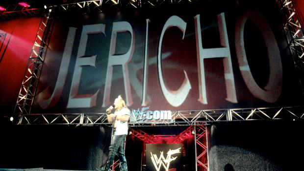
There was just something so great about the old Raw is War set wasn’t there? It was so simple but so very effective. The set was comprised of a giant Titantron and not much else. But it was simple and it definitely worked for the time.
Many great promos were cut in front of that Titantron and many Superstars, Hall of Famers and future Hall of Famers were made on that stage. It’s pretty much impossible to look at that iconic set and not get nostalgic for the days of The Attitude Era.
#10 – Royal Rumble 2000
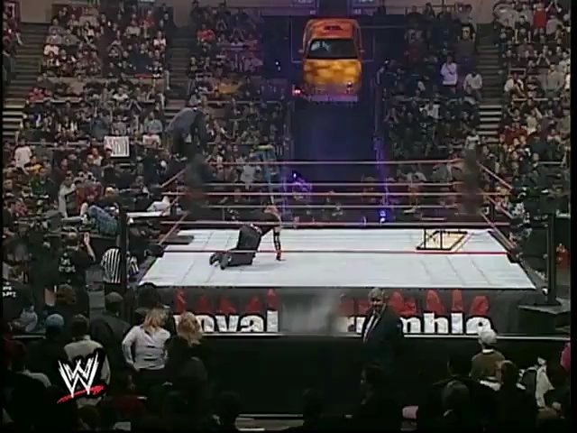
Madison Square Garden is always a little tough for WWE sets in the entrance department. With the way the arena is setup WWE often has to get creative in order to display an interesting set.
At the Royal Rumble 2000 they went with the less is more approach by making the set look like an alley way with a New York City taxi cab over the entry way. The entry way and taxi cab of course proved useful in the classic tag team tables match between The Hardy Boyz and The Dudley Boyz.
#9 – WrestleMania 13
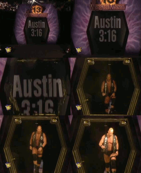
WrestleMania has had a lot of cool sets over the years. This one is far from elaborate but it still gets talked about quite a bit thanks to an unforgettable moment.
“Stone Cold” Steve Austin faced Bret Hart in a career defining match at WrestleMania 13. When the it came time for the glass to shatter and his entrance music to hit, a customized pane of glass literally shattered in the entrance way. The glass shattering helped make Austin’s entrance one of the simplest, but coolest entrances in WrestleMania history.
#8 – King of the Ring 2001
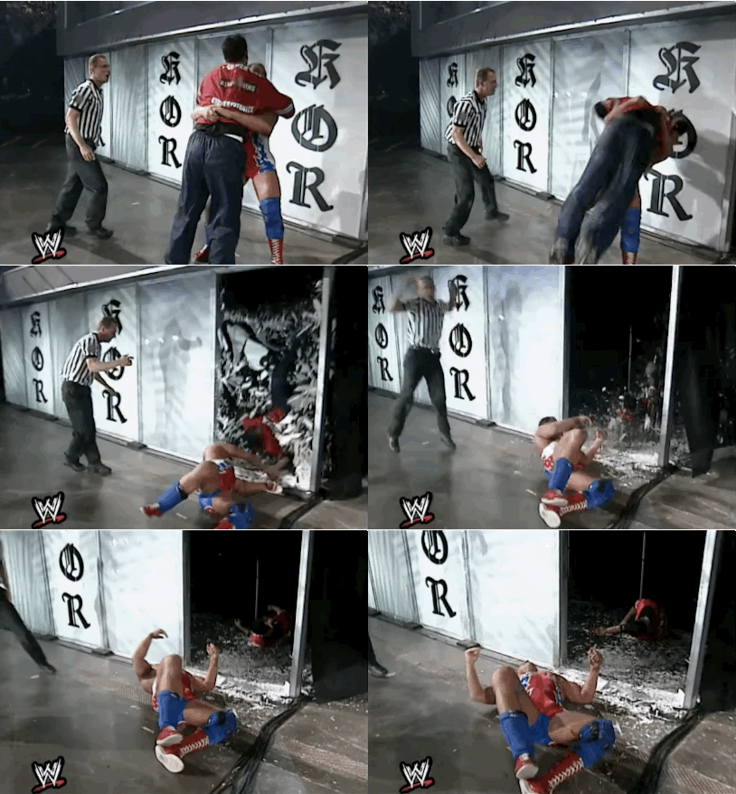
Speaking of glass shattering, the King of the Ring 2001 set is remembered less for what it looks like and more for being a part of the show. Kurt Angle and Shane McMahon faced off in a brutal grudge match at this show and Angle tried to throw Shane through the set. The keyword there is “tried.”
Angle attempted to throw Shane McMahon through the glass at the entrance way several times but he was unsuccessful. After many failed attempts, a persistent Kurt Angle finally threw Shane McMahon through the glass at McMahon’s request.
Kurt Angle revealed recently that someone had ordered the wrong type of glass for the set and that it was supposed to be sugar glass.
“Unfortunately, whoever was responsible for getting the glass, got the wrong glass. It was supposed to be sugar glass, and it was plexiglass. When we did break it, we both got bloodied up.” Angle told WrestleTalk TV.
What a painful, painful mistake.
#7 – Capitol Punishment
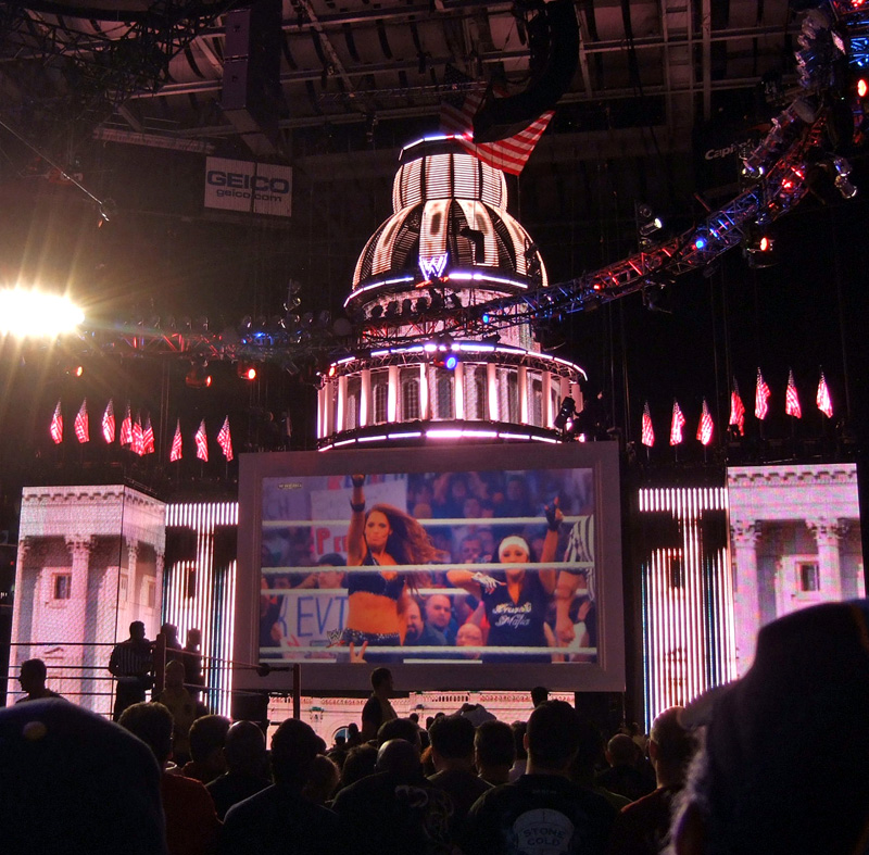
WWE Capitol Punishment certainly isn’t remembered as a classic pay-per-view by any means. But the set was definitely one of the coolest in the history of WWE pay-per-views.
For this show WWE recreated the Capitol building in the nation’s capital Washington D.C. and it looked epic.
#6 – Backlash 2000
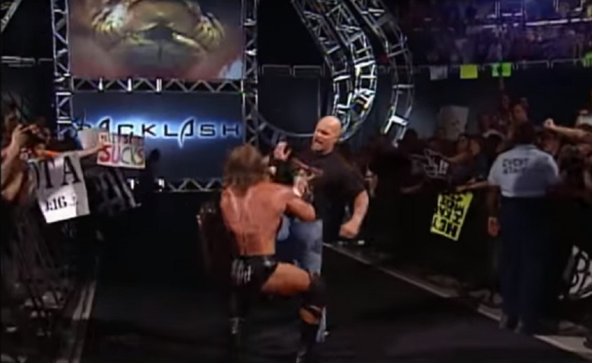
Backlash used to be the perfect post-WrestleMania pay-per-view. Old feuds would end and new feuds would begin. Any of the “backlash” from WrestleMania would usually be settled here.
It was when WWE introduced the swinging sickle in 2000 that they nailed the theme of the show. This set would evolve over the years before it eventually changed to something else. But the sickle is something that was synonymous with the Backlash pay-per-view before WWE dropped the show all together.
#5 – WrestleMania 27
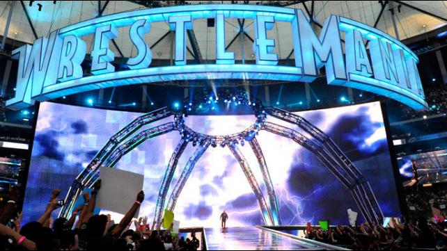
WrestleMania 27’s set is another one of those sets that was simple but very effective. This set was big but refined and the giant screen along with LED lights made it easy for fans to get lost in the show. Then when you throw the extended entrance ramp it’s clear to see that this is one of the most majestic WrestleMania sets of all time.
#4 – WrestleMania 25
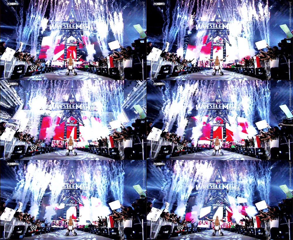
You can always expect something elaborate from the WrestleMania set and WWE didn’t disappoint for their silver anniversary. For the 25th anniversary of WrestleMania they decked out the stage with a giant star and a stage that proved to be the perfect setting for many iconic entrances that night.
#3 – WrestleMania 26

WWE took one step further the next year for WrestleMania 26 when they turned an entire section of the stadium into an impressive display of lights and screens. The set was so massive and overwhelming that it’s almost hard to look at without getting dizzy.
#2 – WrestleMania 30
Most companies would tread lightly when the title of their biggest event of the year ends in the roman numeral XXX. But WWE showed no fear as they integrated the “XXX” into their set.
Purple is another thing that’s hard to pull off when it comes to WWE sets, but the company did it well here for WrestleMania 30 in New Orleans. The colors and the set proved to be the perfect backdrop for Daniel Bryan’s memorable celebration at the end of the night.
#1 – Old School SmackDown

Remember when SmackDown’s set looked like this? It was pretty cool wasn’t it? The old SmackDown fist is arguably the most iconic WWE sets in history. Fans still bring this set up as a topic of conversation constantly.
The set was unique to SmackDown and easily one of the most unique sets WWE has ever constructed. Back before the days when WWE relied almost completely on LED screens, fans were spoiled by awesome sets like this one featuring the SmackDown fist. That familiar fist is a nice throwback to a time when SmackDown was treated like a legitimate show and WWE sets were a lot of fun to look at.



Now we have the same old RAW and SmackDown stage’s for every fucking PPV! It really pisses me off!
На территории Российской Федерации сертификация играет важную роль в обеспечении качества и безопасности товаров и услуг. Прохождение сертификации нужно как для производителей, так и для потребителей. Наличие сертификата подтверждает, что продукция прошла все необходимые проверки. Особенно это актуально в таких отраслях, как пищевая промышленность, строительство и медицина. Сертификация помогает повысить доверие к бренду. Кроме того, сертификация может быть необходима для участия в тендерах и заключении договоров. Таким образом, сертификация способствует развитию бизнеса и укреплению позиций на рынке.
сертификация товаров
На этом сайте вы найдете центр психологического здоровья, которая предоставляет поддержку для людей, страдающих от депрессии и других психических расстройств. Эта комплексное лечение для восстановления психического здоровья. Наши опытные психологи готовы помочь вам справиться с проблемы и вернуться к психологическому благополучию. Квалификация наших врачей подтверждена множеством положительных рекомендаций. Обратитесь с нами уже сегодня, чтобы начать путь к оздоровлению.
http://jasonschklar.com/__media__/js/netsoltrademark.php?d=empathycenter.ru%2Farticles%2Fdepressiya-v-pozhilom-vozraste-starcheskaya-depressiya%2F
На этом сайте вы найдете учреждение ментального здоровья, которая обеспечивает профессиональную помощь для людей, страдающих от стресса и других психологических расстройств. Мы предлагаем комплексное лечение для восстановления психического здоровья. Наши специалисты готовы помочь вам решить психологические барьеры и вернуться к психологическому благополучию. Профессионализм наших специалистов подтверждена множеством положительных обратной связи. Свяжитесь с нами уже сегодня, чтобы начать путь к оздоровлению.
http://lehighvalleynetworkhealth.net/__media__/js/netsoltrademark.php?d=empathycenter.ru%2Fpreparations%2Fv%2Fvenlafaksin%2F